Design the Sleep of Your Dreams: Our Interior Experts Weigh in on the Best for Rest When it Comes to Bedroom Colors
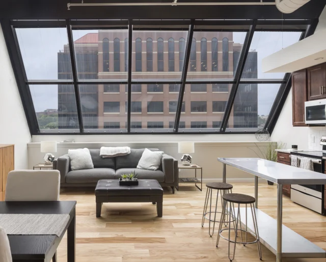
“Sanctuary space” is a buzzword in bedrooms that has expanded beyond Interior Design experts – it talks about the room in a way that is a space for new wellness rituals and comforting design to create a cozier atmosphere.
Late in the day coffee consumption gets a bad rap for restless nights, and insomnia is a growing healthcare concern, but one massively overlooked detail is the impact design has on restful sleep.

Our sleeping environment plays a major role in the quality, and the duration, of our sleep, which is why we’re all ears as our Interior Design experts weigh in on the best for rest when it comes to bedroom colors.
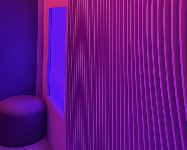
Bedrooms should be a place of destimulation, and dark, grounded colors, like a rich navy blue (Sherwin William’s “Naval”) creates visual cues for the central nervous system that promote the release of the sympathetic “rest and digest”, the complement to our stress hormone’s “fight or flight” that is so often triggered throughout busy schedules and stressful days. Kaitlin Kingrey, Senior Interior Designer at MA Design
Color psychology is powerful and personalized, and while many think of a prescribed palette for the emission of particular emotions, tenured designers know that the translation of these colors are based on each individual’s experiences and exposure. I love using all of the colors of the rainbow to create restful environments, and instead of focusing on color, I find the most influence in emotion by playing with hues and saturation. For a personal bedroom, whatever colors connect with comfort should be key and our subconscious will draw us to that selection – even without an Interior Design degree! In my experience, earth palettes resonate well with more nature-enthusiasts, eliciting feelings of groundedness using mustards, copers or smoked colors. An uptick of rejuvenating and uplifting colors has been trending, with elevated pastels for softer tones like lavenders, creating sensations of youth and ease. Kris Nankivell, Senior Interior Designer at MA Design
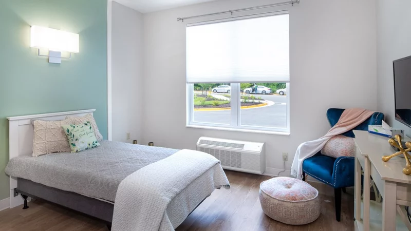
In Apartment Therapy’s recent article, “The Best Color to Paint Your Bedroom for Better Sleep, According to Sleep and Design Experts” Tamra Fuscaldo is quoted. “There are three major go-to’s in color psychology right now for relaxation and rest – basically blues, desert rose or natural neutrals – all used with sanctuary spaces in mind. Neurodiversity is something that impacts us all in different intensities, and harsher hues can be processed more intensely visually, stimulating the autonomic control system – the unconscious system within our bodies that regulates bodily functions, such as the heart rate, digestion, respiratory rate, and pupillary response. For this reason, it’s important to think of bedrooms as a “sanctuary space”, a space we feel safe and protected, and a place for respite.” Tamra Fuscaldo, Director of Interior Design at MA Design